Comprar To Øl Dangerously Close To Stupid - To Øl Djuicy IPA - To Øl 3X Raid
To Øl Dangerously Close To Stupid
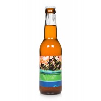
The next beer in the To Øl hop adventure is now a reality – we present to you Dangerously Close To Stupid. An Imperial IPA at 9,3 % ABV with a close to stupid amount of Citra and Centennial Hops in it. It is a bright crisp and super dry-hopped IIPA with a smooth and balanced body.
To make a tight transition between the hop profile and the body we have removed all caramel malts and focused only on basis malts. This is resulting in a nice fresh Spring/Summer IIPA that has a Dangerously Close To Stupid drinkability.
We have for a long time been wanting to do a pendant to the Final Frontier Double IPA, that has this rich caramel body and we think we nailed it Dangerously Close to Perfect with this one.
Cheers, enjoy and be aware!
Words from our label designer Kasper Ledet:
“The idea is to do a design that is as close to stupid graphically. A picture of roses (What? There is a lot of hops in the beer..) half-destroyed by data faults and yet the picture refers to previous beers that are more beautiful in a classic way. It is almost an undermining of these previous labels! Around the neck is the same picture as on the front, but stretched abnormally much in the height (a classic death sin in graphical design) and in a bad quality black and white version. The back label is of course in comic sans – no explanation needed here.”
To Øl D’Juicy IPA
Our version of a juicy DIPA – citrusy citra, fruity mosaic and well rounded centennial, BUM!
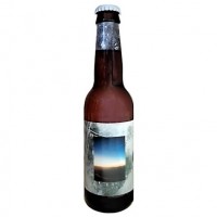
Kasper Ledet on the label design: “The design consists of two photographs: a sunset over the alps and a plant wrapped in some kind of protective semi transparent cover. The funky colours of the sunset gradient contrast the hazy appearance of the plant. The design tries to inject some nostalgia and longing into to this juicy and fruity IPA”
3X Raid
New England India Pale Lager
What happens when you take one of your favourite beers and then times it by three? 3XRAID is the three times dry hopped version of our best loved classic – Raid Beer. A hoppy pilsner at heart, this triple hopped beast has mutated into a gloriously fruity, New England style ‘India Pale Lager’.
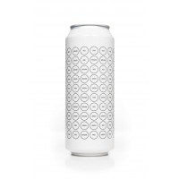
Kasper on the label design: The design consists of the same basic grid of circles as the original. I guess i was a bit tired of colours when i made the artwork. So i decided just to write the names of the colours and leave it to the viewer to imagine what they would actually look like. Alternatively you could get hold of some markers to colour the artwork yourself.
- Estrella Galicia 1906 Red Vintage - Estrella de Levante Clásica - Estrella Damm
- Moon Three Threads - Aloumiña Moura - Moritz Negra
- BBC Monserrate Roja - Cameron’s California Sunshine APA - Cameron’s Cosmic
- Roma Pera Madura - Leyenda Golden Ale - Savia de Ygdrasil
- Fuller’s Honey Dew - Fuller’s Vintage Ale - Fuller’s Past Masters 1914 Strong X
- Corona Extra - Cerveza Sol - Inveb Brahma
- Hobgoblin Legendary Ruby Beer - Brewdog Hop Fiction Pale Ale - BrewDog Prototype Black IPA
- Gruut Blond - La Rulles Estivale
- Capfoguer Meoasako - The One Scotish Ale Export 80 - Reptilian Quetzal
- Carma Rubia Blonde Ale - Vor Vorágine - Barceloka After Pilsen
- Redwillow Smokeless - Harviestoun Ola Dubh 16 Year Special Reserve - Tullibardine 1488 Whisky Ale
- Abadía de Aribayos Z Abadía - Mesopotamia Imperial Stout - Abadía de Aribayos Z IPA
- Ezel Wit - Boscoli Kriek - Lindemans Oude Kriek Cuvée René
- Estrella Galicia 1906 Reserva Especial - La Milnueve - San Miguel Especial - San Miguel Selecta
- Redhook ESB - Flying Monkeys Coast to Coastles - Tres B Bitter Summer ESB
- Dawat 7 - Dawat 5 - Dawat Elements Pedro Ximénez
- Moor Confidence - Wychwood Black Wych - Robinsons Trooper Hallowed
- Mikkeller Porter BA Bourbon - Antiga Manumisión - Octavo Arte 1521
- Yakka Brown - Sanfrutos / Yakka Winter Ale - Yakka Beers Attack
- Bayura La Herminia - Nurse Ipaprofeno - Curuxera Pilxen
- Tripel Karmeliet - Abbaye D’Aulne Blonde 6º - Tyskie Gronie
- Amstel 0.0 - Brouwerij `t IJ Natte - Krušovice Černe
- Mezquita - Galician Brew Sabela - 7B Siete Barrios 1 + 1 = 3
- Mahou Clásica - Amstel Oro - Cruzcampo Cruzial
- Gulden Draak Classic - BrewDog Abstrakt AB:18 - Mount Saint Bernard Abbey Tynt Meadow
- Ayinger Celebrator - Schloss Eggenberg Samichlaus Classic - Ayinger Winter Bock
- Amai Gold - Tempus Dorada - La Gitanilla Cordobesa
- BBC Monserrate Roja - Apóstol Dubbel - Apóstol Weizen
- Amstel Oro - Miller Genuine Draft
- Estrella Galicia 1906 Red Vintage - Maisel & Friends Bavarian Ale - Staropramen Premium Lager
- Barret Caubeen - Edge Brewing White Liar - Guineu NZ IPA
- Cierva Blond Ale - Familia Serra Butoni - Seef Bier
- Te Deum Bruin - St Feuillien Cuvée de Noël - Boon Kriek Mariage Parfait
- Estrella Galicia 1906 Red Vintage - Mahou Cinco Estrellas - Ambar 1900
- Mikkeller Henry Jagger - Mikkeller Spontanale - Mikkeller Vesterbro Brown
- Mahou Clásica - Alhambra Especial - Asahi Super Dry
- La Puntaire d`Arenys - Naparbier Hop Doom - La Negra de las Doce Vermella
- De Molen Dag & Dauw - La Trappe Witte Trappist - De Molen / Omnipollo Sitis
- Illice Augusta Aurum - Tormo Irish Red Ale - Maeloc Sidra Extra Ecológica
- Emelisse D.I.P.A. - Emelisse Urtype Pilsener - Emelisse Porter
- Birra del Borgo My Antonia - La Piñonera Strong Ale - Tübinger Tübinator
- Dougall’s Session Stout - Dougall’s IPA 8 - Redneck Brandine
- Caleya Asturies Pale Ale - Judas
- Bizarra Weissbier - Ambar Caesaraugusta - Cazurra Burton Ale
- Tarraco IPA - Ratpenat 2014 IPA - Barbarian 174 IPA
- Montmirà Bresca - St. Louis Premium Kriek - Mort Subite Xtreme Kriek
- Acacia Burdeos - De Glazen Toren Ondineke Tripel - Silly Enghien Noël Triple Blonde
- Tübinger Hoppiness IPA - Tübinger Tübinator - Flannery’s Irish Cream Stout
- Heineken - Sagres
- San Miguel Especial - Alhambra Especial
- Corona Extra - Tecate - Indio
- R115 Evil Wedding - BIIR / Brewerkz Hoppy Monk - Hazteunlitro The Fucker In The Rye
- Cantillon Iris - Dubuisson Cuvée des Trolls Triple
- Modelo Especial - Tecate
- Mezquita - Voll-Damm - Alhambra Tradicional
- One Road - Birra 08 11 Llúpols - Amager The Bastard Princess
- Alhambra Especial - San Miguel 1516 - San Miguel Magna
- Victoria - Grupo Modelo - Tecate - Indio
- Helheim Hidromiel - La Fragua Hidromiel Clásica - La Runa Hidromiel Dulce
- Volaera Especial - Debla IPA - Nómada Bokashi


